
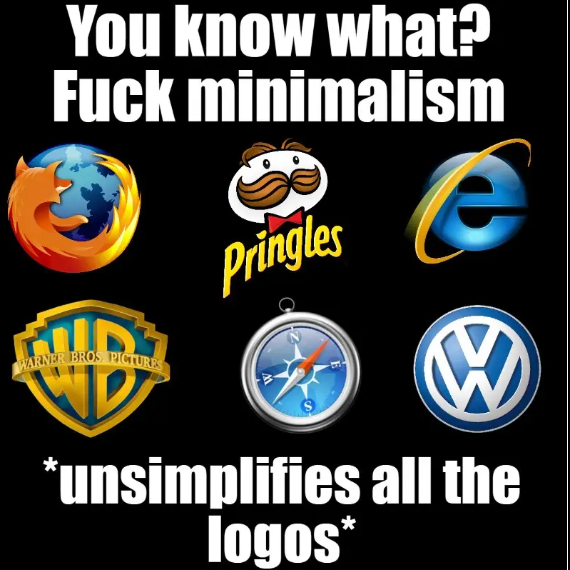
@hideki Months practicing 3D modeling, composition and what-not for the world to head towards simple shapes and solid tones.

@chuculate @hideki I watched a video about it and it's more about being easily recognizable and not to be overwhelmed when looking at them on displays, particularly mobile.
I don't dislike the new minimalist icons personally. It's just kind of important to me that there's not too much mixing of styles.
I don't dislike the new minimalist icons personally. It's just kind of important to me that there's not too much mixing of styles.
@okabe_rintarou that mixing of styles, do you mean accross companies or inside a single company?
@hideki
@hideki
@chuculate @hideki Anywhere, but I was mainly thinking of an OS. One fancy old icon sticks out and draws attention.