
is there a website where you can like, commission people to write software for linux?

You could probably find someone lurking around the Fediverse that would code for cash.
@Awoo @applejack literally the only thing keeping me from using linux wholesale at this point is that there is absolutely horrible colorblind support.
the programs that do provide filters are either laggy as hell, super unwieldy to use (like needing to have a second monitor just to see what the first one looks like with the filter), or actually simulate colorblindness.
i don't necessarily have the money to commission a whole ass program that would drop a filter over your screen right now but it is something i'd eventually like to see happen.
the only package it seems was relatively good for colorblindness is gnome-mag but it's loooong been abandoned and doesn't work anymore, plus i have no idea if it technically actually worked or not.
just using monitor or GPU color correct isn't a very elegant solution either, because doing that shifts colors in total rather than just taking specific color ranges and either amplifying or desaturating them. if i try and boost reds, for instance, i end up with grays becoming slightly red too which windows' filter doesn't do. if it does it is way too minor of a difference to notice. maybe they're doing some black magic or something but Android and iOS colorblind settings do the same thing too, just in reverse (they simulate it instead).

@beardalaxy @Awoo Programs like redshift work on Xorg and can filter the colour, idk about Wayland
I also think programs like Picom allow OpenGL shaders and can be made to work per-window
I know how to program GLSL and can look into it, though idrk what a colour blindness shader does
@beardalaxy @Awoo Basically this, it's fairly simple. Just a formula run over each pixel
@beardalaxy @Awoo Looking up "colour blindness filter" I only find colour blindness simulating filters
How do I find them?
@applejack lol ain't that the problem xD
most colorblind filters simulate it even if they're saying they help it. for instance, the majority of video games.
someone took screenshots of path of exile with all the colorblind filters for windows 10, but it doesn't exactly have the greatest array of colors to show off. i'd try and take some myself but i honestly don't know how this person got these screenshots; taking them in windows gets rid of the filter for me.
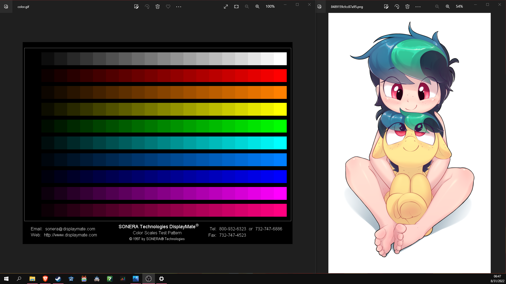
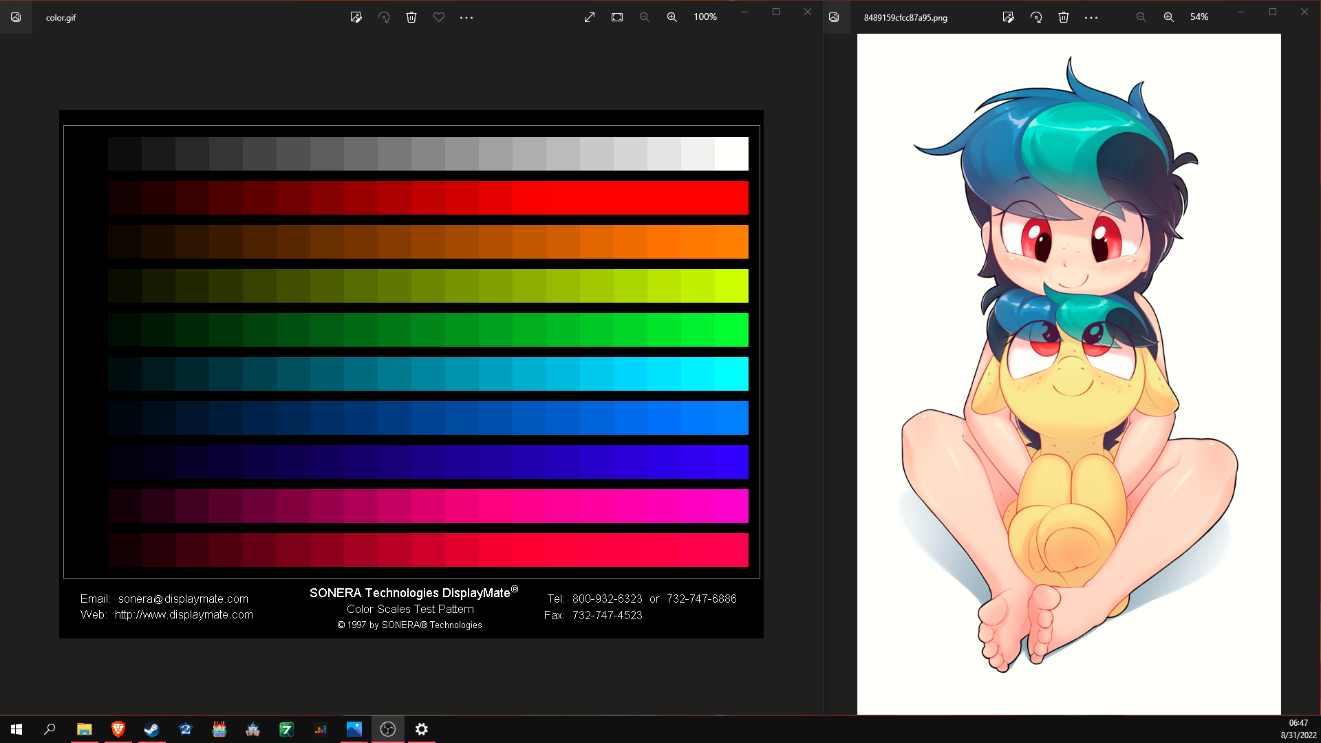
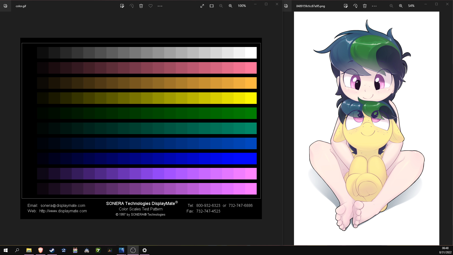
in order: normal, deuteranopia, protanopia, tritanopia.
@beardalaxy First is original. Her hair is greyish blue to green to dark blue from left to right
Eyes are light red
The filly's coat is banana yellow
The girl has normal skin colour
Second is a filter
img:map(function(r, g, b)
return math.min(r * 1.2, 1), math.max(g * 0.8, 0), b, 1
end)
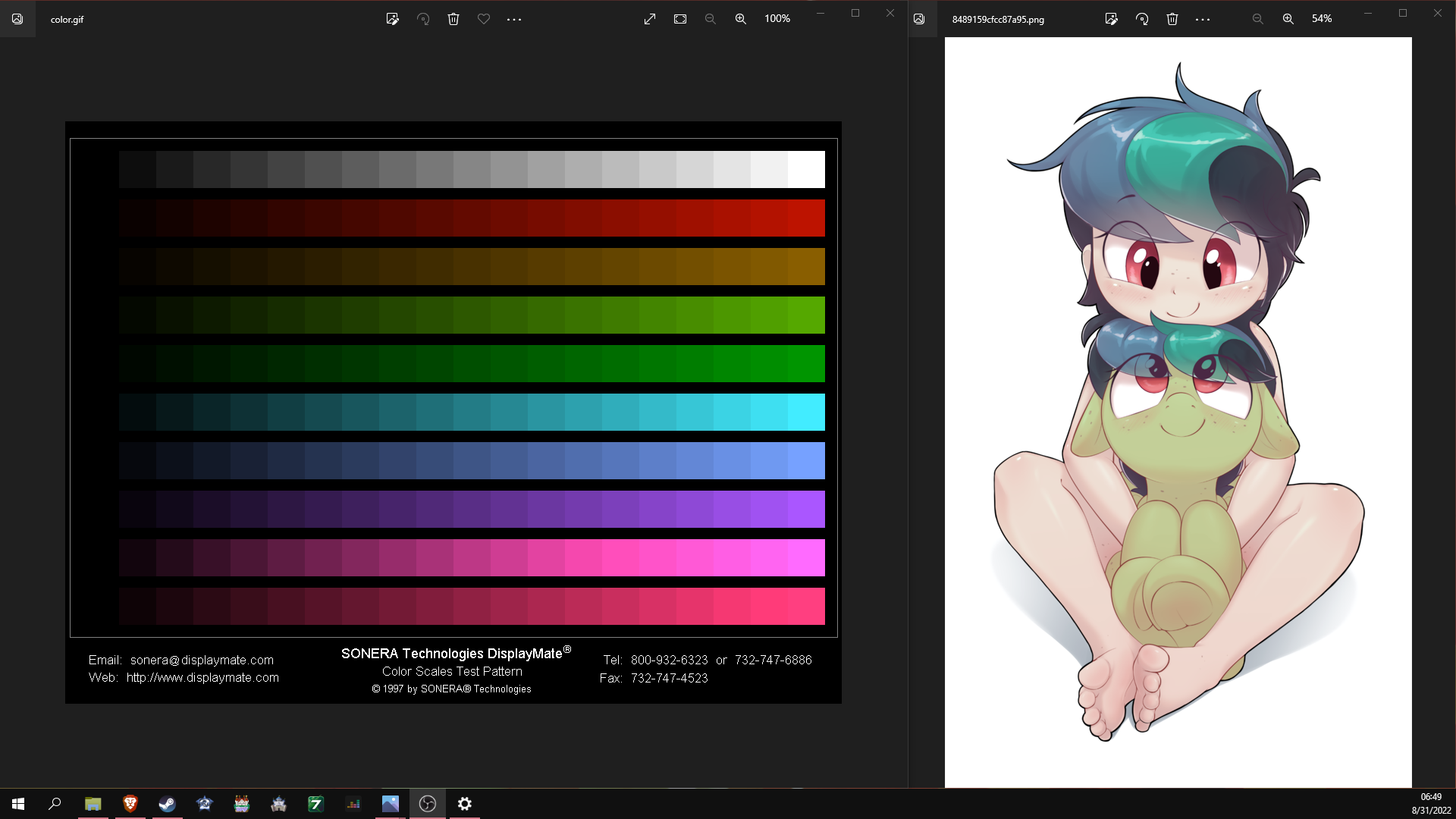
@applejack i can definitely tell the red eyes are brightened up a bit, for me it goes from "probably green" to "probably red."
green in the hair is at a pretty good level.
the skin gets pretty pink though, don't know how to explain it exactly but the windows filter kind of brightens the skin while turning it to a redder hue while yours darkens it with a redder hue, if that makes any sense.
then there is the problem of the background being blue instead of white lol. you're headed in the right direction though.
i'm working on getting an example video or something here.
@beardalaxy I was kinda expecting the background bit, and the skin is just an inbetween of that. I'm thinking if I alter the strength of the filter based on how much relative redness there is it should work
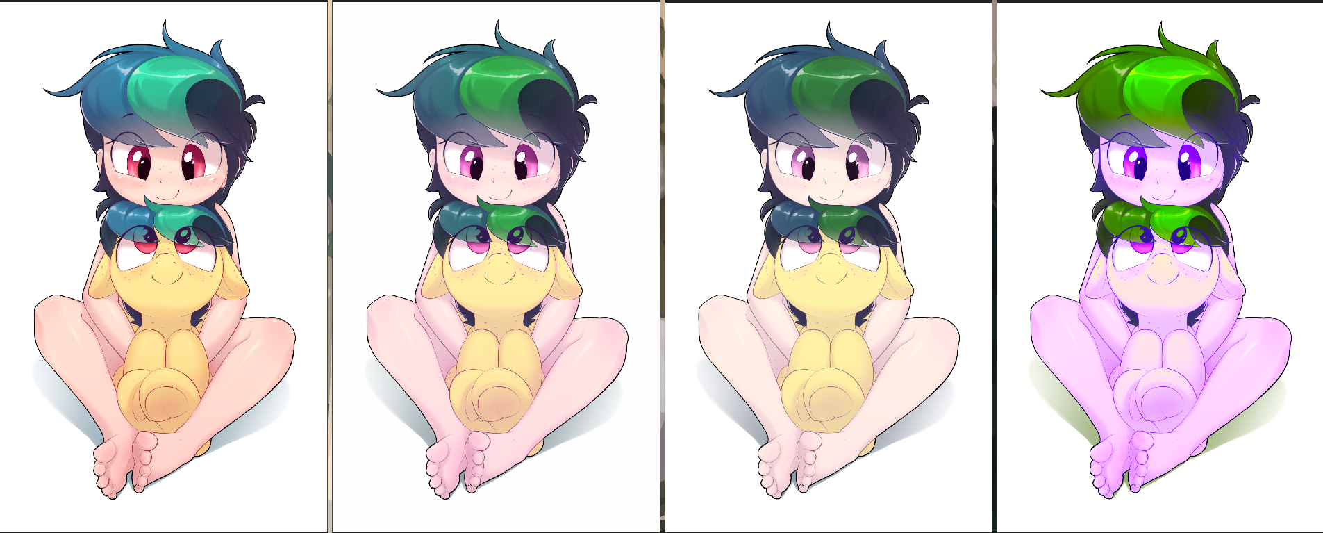
@applejack here are some comparisons. one thing i don't like about windows' filter is that it blows out reds to the point where you lose gradients, but it's better than not having the filter at all. i wish i could change the strength of it.
it's worth noting that i have no idea if the protan/tritan settings are accurate, since i don't have those types of colorblindness. i'm assuming they are though, considering the deutan one is.
in order: normal, deuteranopia, protanopia, tritanopia.
@beardalaxy It says it's supposed to help
2. Simulation of color blindness by reducing the colors along a dichromatic confusion line, the line parallel to the axis of the missing photoreceptor, to a single color.
3. Compensation for color blindness by shifting wavelengths away from the portion of the spectrum invisible to the dichromat, towards the visible portion.
The python code wouldnt run because it's python2. I tried transcriping the JS code to Lua to test it and Proto looks 1:1 with your reference but nothing else. I'll try transcriping and comparing the python code because I think the JS code might not be the best, they define options.amount in a weird way and then don't use it
Same order
@beardalaxy Okay, I got the python to run and hooooly shit it's slow. My Lua script using my image library took 1.09s and the python one using numpy took 35.49s
Python output looks the same as with the Lua script. It says explicitly that it's to make it better
@applejack i think the goal might be to help colorblind people see differences in color, because it can be hard for them to see the difference between red and green at certain hues or whatever. it seems like that would worsen the effect though...
the problem is that it doesn't display the color that a colorblind person would see if they were not colorblind. you say her eyes are supposed to be red, but in the "color corrected" image they look kind of like a pale green with a little bit of pink in them. the skin looks worse, it goes from a light tan color to practically pale white. that second image is a pretty accurate example of how i see things normally.
it's the exact problem i was bringing up, how most colorblind filters are actually simulations. the only game i know for sure applies a correct colorblind mode is destiny 2 (1:04): https://youtu.be/sGUg1vofItI?t=64
i have no idea how this happened to be honest, why people agreed that it was a better idea to show colorblind people the colors they see better and just forget about the ones they see worse. i found out about this whole debacle when i played modern warfare remastered because the flames were pink and the night vision was so green i couldn't see anything... it was unplayable. then when my friend and i were playing hat in time he kept saying that all the red stuff looked brown. meanwhile, i had been using these filters my entire life and just thinking that's actually how the world looked.
imagine a game with red and green team colors, and then the colorblind mode makes the green brighter and the red duller. for someone who normally sees like that, the colors become practically indistinguishable from each other.
@beardalaxy O, I got it I think. I managed to alter the function so it doesn't shift it beyond the plain correction
@applejack that's definitely getting better, with the eyes especially. the red in there is not as blown out as the windows filter makes them, they look really nice.
the hair is supposed to be purple right? because it's leaning back into green again for me. the green part of the hair is still way too bright too.
then there's the skin, which still is lookin more pink than tan. it's a step in the right direction, i think, but needs some more tuning.
compare this filter with the original put through the windows filter so you can see what i mean about the hair/skin:
@applejack i just noticed the blush too, i can't really see it at all in the windows filter and it is definitely more visible than the original. some of the shadows get lost on windows too.
@beardalaxy The hair is not supposed to be purple, it's from left to right cyan-grey, light green, dark cyan. It's mainly a bit darker and less green on the winfiltered one
The skin on the winfiltered version looks orange while myfiltered version looks pinkish. Trying to play with that rn
@applejack oh yeah haha. this is what happens when someone whose brain is wired to not relate anything to color tries to relate things to color xD
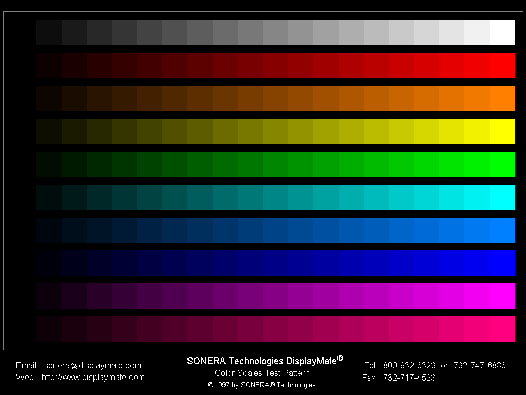
@beardalaxy 100%, 70%, 50%
Instead of ignoring the shift I invert it
@applejack that 50% one is better than the windows one hands down! gradients in the red way more visible but not too deep, the linework isn't affected as much if at all, and the skin tone appears to be more natural.
only complaint is that the green is a little too bright in comparison, but i don't think it's a huge deal, it's REALLY close.
@beardalaxy Great. I'll try and put it in a shader now then
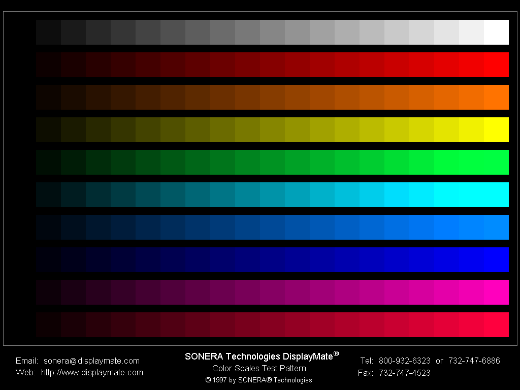
@applejack before you do that, would you mind plopping this into the filter just to see how it might affect other colors that aren't represented here?
@applejack oh man, the red and the violet/pink (whatever they are, the two at the bottom) look soooo much better, they actually have a full gradient instead of getting blown tf out halfway through the chart.
the only real problem i see here is that the last three squares of green/cyan(?) are really hard to tell apart, especially the last two. like i was saying with the pony pic it looks like the green could go a little darker (or a bit more saturation?), that might fix that issue. not a huge deal though honestly, like i said it's already a massive improvement where i was really only looking for a replication xD
@beardalaxy We have shaders now. Everything is black and white for me. Should only take me a second to convert it and I can advice you how to fiddle with it more from there on your own
@beardalaxy https://upload.cutefunny.art/correct.frag
picom --backend glx --glx-fshader-win "$(cat correct.frag)"
It seems to work
@applejack i'll give it a shot when i wake up, headed to bed right now. thanks so much man, i'll try and fork over some cash to ya at some point :)
@beardalaxy Don't worry about it :)
Ignore that as long as they are even slightly distinguishable you're fine
@Corfiot @applejack you know what that's totally fair lol
probably can fix that by playing with screen gamma/contrast/brightness but I don't think it needs fixing at all