Coded Artist @coded_artist@gameliberty.club
- High Skill
- Coding, Godot
- Low Skill
- Drawing, Memes
- Best
- To destroy your enemies, to have them driven before you, and to hear the lamnations of their women.
- Worst
- Python
I draw, code, and make memes sometimes.
Joined Mar 2019
Coded Artist
boosted
@Jens_Rasmussen @LittleTom Yeah, I believe so.
Here's what I'm thinking:
This kind of light purple/magenta colors, also known as "bisexual lighting", is a choice that's common to designers of a certain culture (or mindset / orientation / demographic, whatever).
The title image is decided on by the lead designer, and this indicates to an extent the culture of the rest of the development team.
It's not a 100% guaranteed, but it's a good indicator:
Bisexual lighting ↓
probably progressive lead designer ↓
likely progressive team ↓
progressive values, writing, and talent hiring policy ↓
failed project.
This chain can be broken at any point, where you can have competent developers and gay designers, but it's usually not the case.
@Jens_Rasmussen @LittleTom WotR wasn't too bad, but it was very gay.
I think purple games tend to be gay, and gay games tend to be failures.
So it's a case of looking at A→C and missing the A→B→C.
Still, it's a fairly good model, decent predictive capability.
Coded Artist
boosted

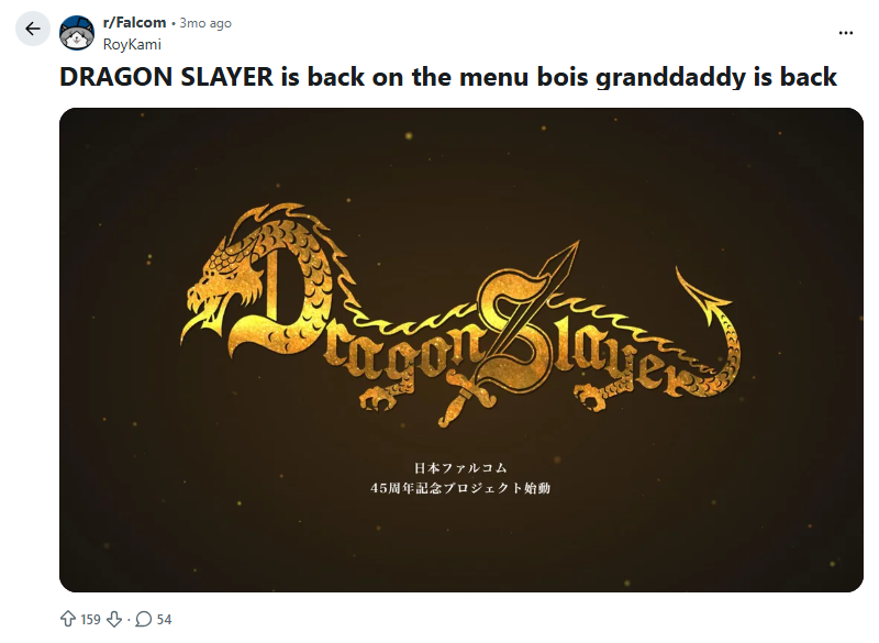
oh yeah, it looks like falcom is bringing the dragon slayer franchise back. i hope we get some lore that's sorely lacking.
Coded Artist
boosted


Coded Artist
boosted

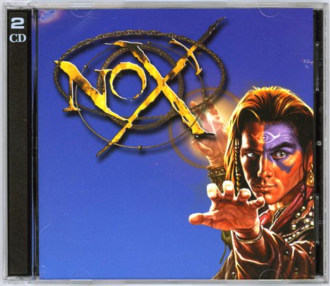
@thomasroiloup @ChristiJunior For some reason you reminded me of Nox, but that was in glorious 800 by 600.
Coded Artist
boosted

Coded Artist
boosted
Coded Artist
boosted
Reminder that high-end specs and 4K graphics are worthless if they're not used in the service of Beauty.
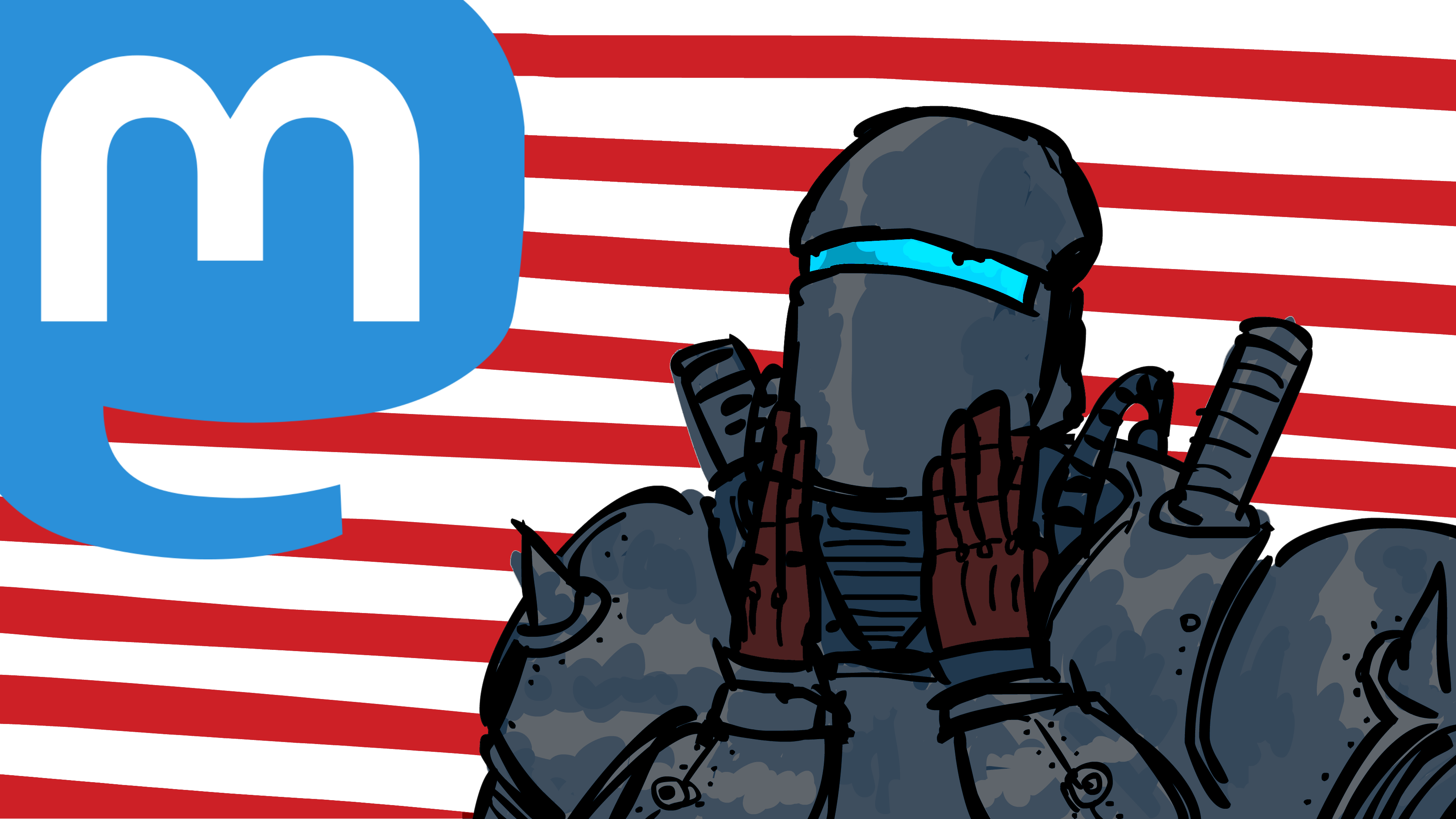
@SNEK What is this Hillary Clinton looking thing?
Coded Artist
boosted

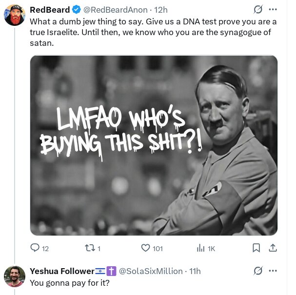
Literally worse than the holocaust.
Coded Artist
boosted
Coded Artist
boosted
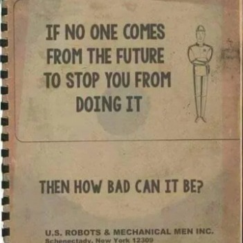
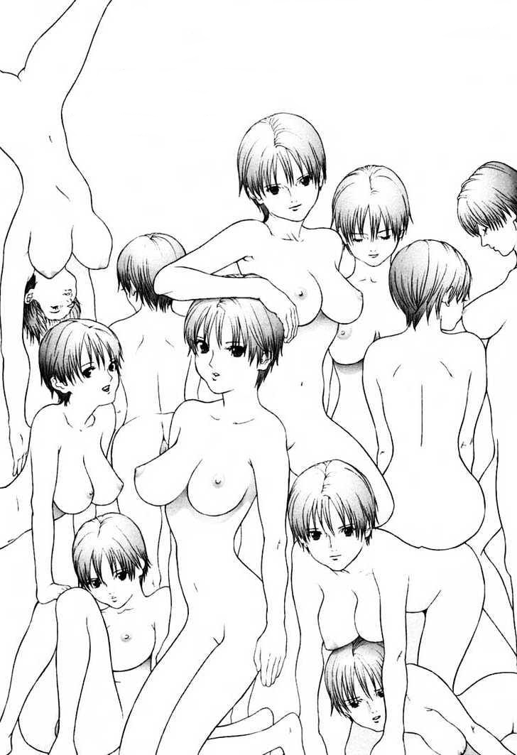
Immediately remembered this gem.
Coded Artist
boosted
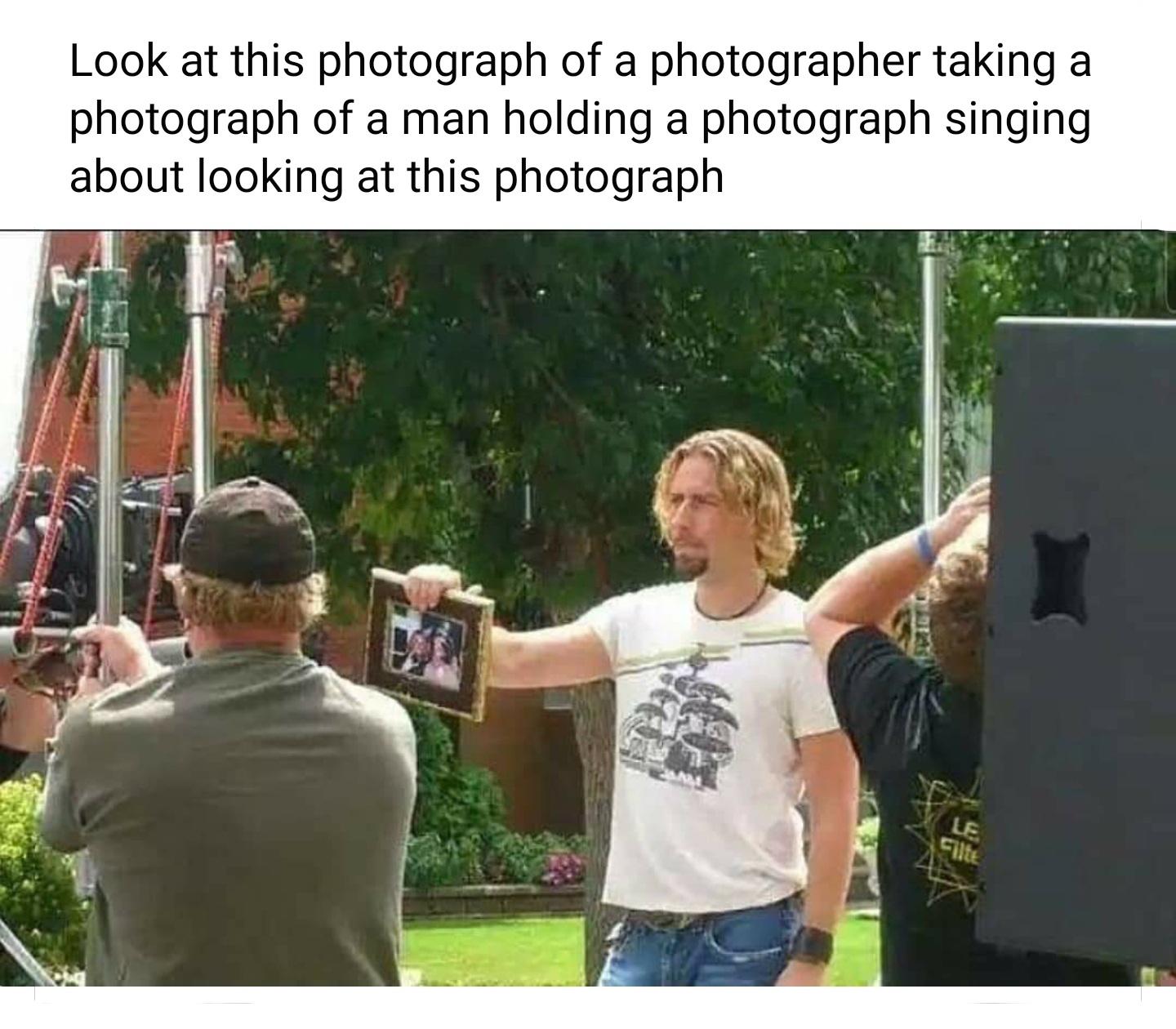
''Look at this." -Graf
- High Skill
- Coding, Godot
- Low Skill
- Drawing, Memes
- Best
- To destroy your enemies, to have them driven before you, and to hear the lamnations of their women.
- Worst
- Python
I draw, code, and make memes sometimes.
Joined Mar 2019