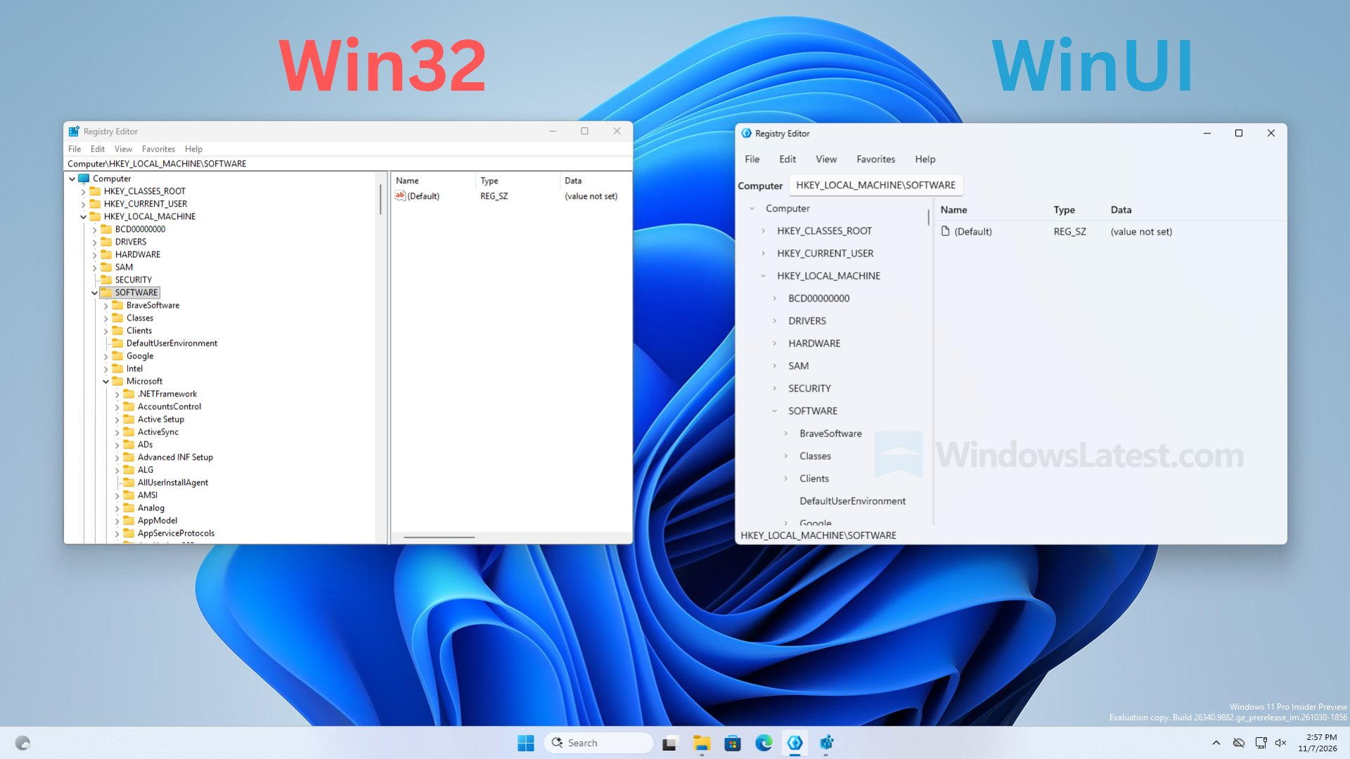

@mac_ack @matrix yeah, i really don't see any meaningful difference, just an update to fit the visual theme of Windows 11.
@pettanko @matrix somehow they managed to get less important information on screen even after removing clutter
@mac_ack @matrix Because they increased the font size. Making things easier to see is a fair tradeoff for decreasing information density in my opinion.
@mac_ack @matrix Yeah that's true. Really goes hand-in-hand with increasing the font size, from a design perspective.

@mac_ack@hidamari.apartments @pettanko@tsundere.love @matrix@gameliberty.club UI designers are like
* { padding: 16rem; border-radius: 2rem; }
Wow so modern and minimal
​:pippa_soypoint:​

@pettanko @matrix @mac_ack
I was wondering, why is the new o e so much less expressive.

Not only did they increase the font size (bad move), but they also removed a lot of visual contrast from the tree view.

Amazing, how much damage they did for such a minor-looking change.

Sign in to participate in the conversation
Game Liberty Mastodon

Mainly gaming/nerd instance for people who value free speech. Everyone is welcome.