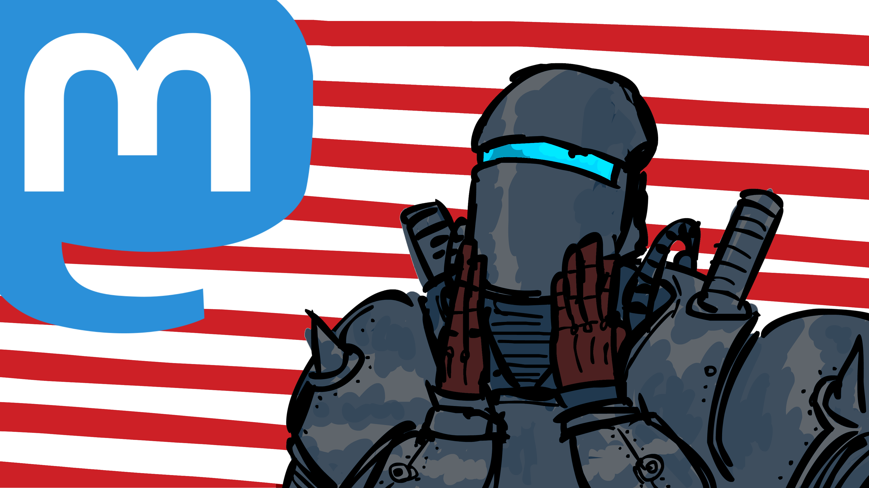
He's there, he's looking for you, and he's gonna bash your brains in.
I am getting a bit behind, i was supposed to upload this one yesterday.
Anyways, made this thing instead of the offical prompt, i didn't wanted to make snots or boogers.
It was supposed to be loopable but i forgot to change one thing so what the hell.
Okay so with this one i'm giving an end to this year's #inktober challenge ![]() , as always it was very fun to do and i hope it was as fun to you looking at all the shit i made for it, it made me learn a lot, both in regards of my skills and creativity output.
, as always it was very fun to do and i hope it was as fun to you looking at all the shit i made for it, it made me learn a lot, both in regards of my skills and creativity output.
Reminder that you can check all my blender posts in my pixelfed account @takenori
@hideki I get why random colour mode isn't the default (looks kinda silly) but I still really wish it was
@applejack you know you can set it as default, right?
Set your workspace and your options exactly how you want them, then file > defaults > save startutp file. Then Blender will start like that every time.
I prefer this random mode because it allows me to know better which objects are separated and which are joined and all.
@Loki gracias, mi hermano en cristo.
Se me ocurrio en la tarde cuando fui a comprar papel ![]()
@Loki y originalmente iba a tener mas cosas como buhos y otras cosas mas pero es complicado hacer algo mas detallado en un dia y con un trabajo normal.
Ya habra tiempo para hacer algo mas en forma.
@Arkana thanks!
The lighting is a bit stupid and the details are barely visible but it always serves as practice.
@hideki oh shit i'm going to eat all of them
@hideki
hmm...
How did you achieve the motion blur ![]()
@LukeAlmighty it's a scene of two keyframes.
For keyframe 1 the ball is a bit behind the end position, and keyframe 2 the ball is where i want it.
Then i enabled the motion blur on the render settings (cycles), rendered only the frame 2 and it's done.
@LukeAlmighty haha i'm gonna use that word from now on
@ademan for some reason the cutout wasn't casting shadow (probably because it didn't had any depth), the thick one is only there to cast shadow but it's invisible to the camera.
@hideki
Now, that is ambitious.
@ademan thanks my mang, the height map and the metallic map help to make it look less simple than what it is too .

wireframe